
7 Popular Hero Section Layouts: Mastering the First Impression on Your Website
Find the best hero section layouts and design tips to make your homepage stand out. Learn essential elements and best practices for higher conversions.
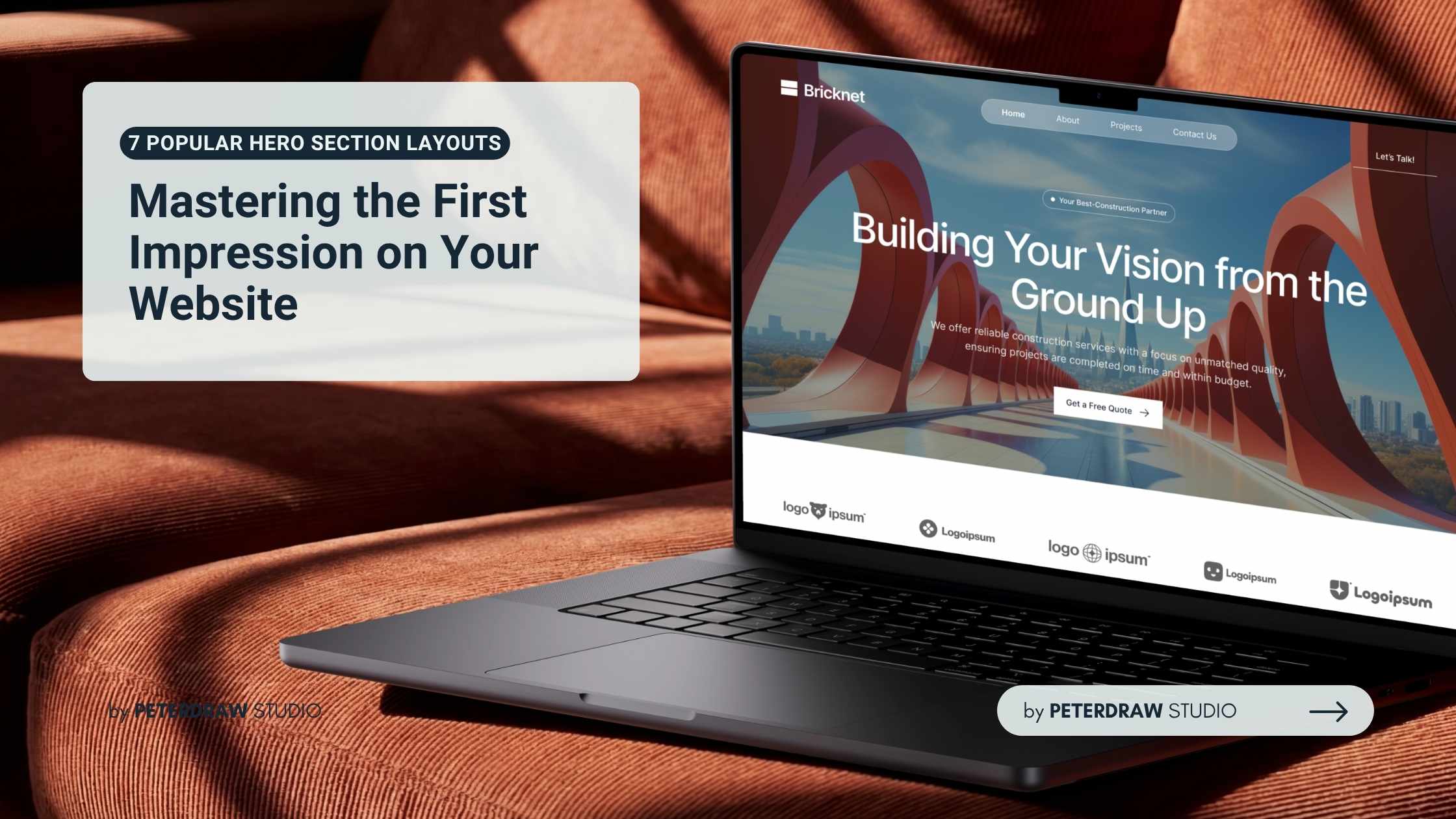


Hero section layouts play a pivotal role in modern web design. As the first visual and textual element visitors encounter, these eye-catching areas can determine whether users stay to explore or bounce away within seconds. A well-crafted hero section combines compelling visuals, clear messaging, and strategic calls to action to hook attention instantly.
The hero section, often referred to as the hero banner or above-the-fold area, sits prominently at the top of a homepage or landing page. Its primary purpose is to deliver an immediate understanding of your brand, product, or service while encouraging visitors to take the next step.
Users form opinions quickly. According to the Nielsen Norman Group, users often decide whether to stay or leave a page within the first 10 seconds. This makes optimizing your website hero sections critical for engagement, conversions, and overall user experience. Thoughtful hero section layouts help set the tone and communicate value right away.
Before diving into specific layouts, focus on the foundational building blocks. A strong hero typically includes these core components. Keeping these elements balanced prevents clutter and maintains focus on the user’s journey.
Hero section layouts come in many styles, each suited to different industries and objectives. Experimenting with variations helps designers create unique experiences while meeting user expectations.
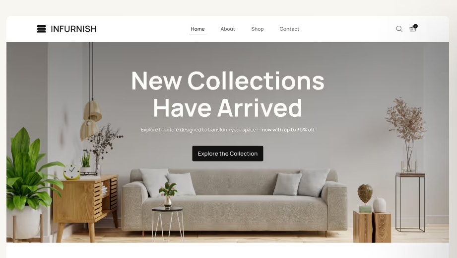
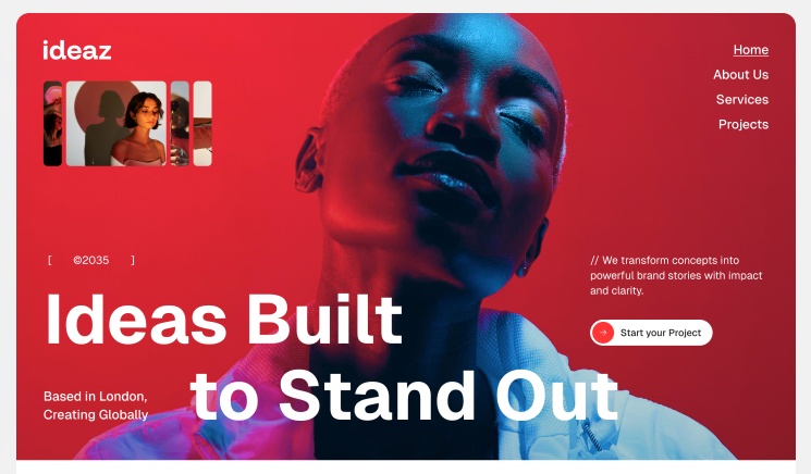
This classic approach uses a stunning full-width visual. Overlaid text delivers the main message clearly. It creates an immersive experience for visitors. This layout works well for creative agencies and travel sites. The key is strong text contrast and readability. Subtle parallax effects can add extra depth.
Split layouts divide the screen into two clear areas. One side shows content and CTA. The other side displays visuals or product mockups. This balanced approach suits SaaS and product websites. It creates a natural visual flow for users. On mobile, sections stack vertically for easy reading.
Minimalist designs focus on clean typography and white space. They let strong messages stand alone effectively. These layouts work best for professional services and blogs. A simple gradient background adds quiet elegance. Oversized headlines create modern sophistication. This style avoids visual clutter completely.
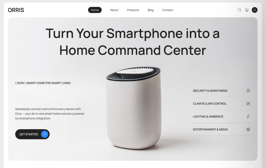
These layouts place the product at the center. They use realistic mockups and animated demos. Visitors can quickly visualize themselves using the product. This approach works great for apps and e-commerce sites. It helps boost conversion potential significantly. Interactive previews make the experience more engaging.
Carousels display multiple messages in one space. They help highlight various features or offers. However, they need careful and thoughtful implementation. Many users only notice the first slide. Always place your strongest content at the beginning. Smooth transitions improve overall user experience.
Modern designs add subtle animations and hover effects. They may include 3D elements or scrolling movements. These features make the hero more engaging. Performance optimization remains very important. Excessive animations can slow down page loading. Always test thoroughly on mobile devices.
These layouts use overlapping elements and diagonal divisions. Unconventional typography adds bold personality. They help standout brands express unique character. However, clarity must remain the top priority. Accessibility should never be compromised. This style works well for creative and daring brands.
Creating outstanding website hero sections goes beyond aesthetics. It requires strategic thinking and user focus. A great hero captures attention instantly. It also drives action effectively. Follow these proven tips:
Designing strong hero sections takes practice and thoughtful attention. Start by understanding your target audience deeply. Test different designs with real users regularly. Small adjustments can create significant improvements in engagement. Stay open to feedback and new ideas throughout the process.
Keep observing how people interact with your website. Combine creative elements with useful performance data. Create hero sections that feel both beautiful and genuinely helpful. This balanced approach turns casual visitors into loyal users more effectively.
Well-crafted hero section layouts turn first impressions into real opportunities. They capture attention quickly and encourage action. Keep refining and testing your designs consistently. Your website will stand out and deliver better results over time.