


7 Popular Hero Section Layouts: Mastering the First Impression on Your Website
Find the best hero section layouts and design tips to make your homepage stand out. Learn essential elements and best practices for higher conversions.


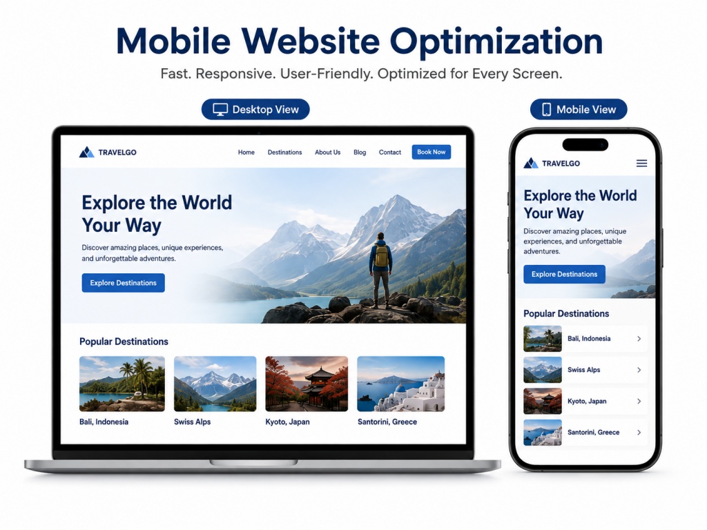
Over 60% of web traffic comes from mobile devices (Scalify). So, ensuring your site delivers a seamless experience on small screens is essential. This process is known as mobile website optimization. It involves making your website fast, user-friendly, and responsive across all devices. This directly impacts traffic, engagement, conversions, and search engine rankings.
Google uses mobile-first indexing. It means it primarily evaluates the mobile version of your site for rankings. A poorly optimized mobile site can hurt your visibility in search results, increase bounce rates, and lead to lost sales.
Users expect lightning-fast loading times and intuitive navigation. If your site takes more than a few seconds to load or frustrates visitors with tiny text or hard-to-tap buttons, they'll leave immediately. Optimized mobile sites see higher engagement, better conversion rates, and improved customer loyalty.
Mobile website optimization also ties into Core Web Vitals, including LCP, FID, and CLS. Google considers these metrics when determining search rankings. Sites that perform well here gain a competitive edge.
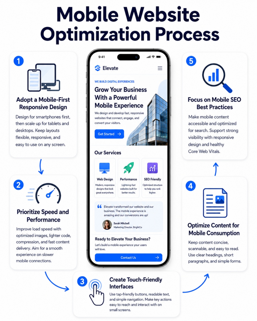
With mobile users expecting quick, intuitive, and visually appealing interactions, effective mobile website optimization is key to reducing bounce rates and driving conversions. Focusing on proven strategies helps create websites that truly perform on every device. Here are the most important steps to optimize your site for mobile users.
Start designing for mobile devices first. Then, scale up for tablets and desktops. This "mobile-first" approach ensures the core experience is excellent on smartphones.
Responsive design automatically adapts elements like images, text, and navigation to fit any viewport, providing a consistent experience.
Page speed is critical for mobile users on potentially slower connections. To address it:
Tools like Google PageSpeed Insights can help identify and fix issues.
Mobile users tap with their fingers. They need easy targets. Good design prevents frustration and improves navigation. Mobile users interact with their fingers, not a mouse.
Mobile users scan content fast. They prefer short and clear text. Make every word count on small screens. To achieve it:
Mobile SEO boosts your visibility. It works closely with good design. Strong practices improve rankings and user experience. How to do it?
Many helpful tools support your efforts. They make optimization easier and more effective. Choose the right ones for your needs. These can be your priority choice:
The tools may help, but for maximum optimization, you still need to do more. Set up regular audits to catch regressions after updates or new feature additions.
Measuring success is essential. Track key metrics regularly after changes. This reveals real progress and guides future improvements. Track key metrics after implementing mobile website optimization changes:
Mobile website optimization is an ongoing process. User behaviors, device capabilities, and search algorithms evolve, so stay updated with industry trends like progressive web apps (PWAs) or new performance standards.
Although much preparation and anticipation has been made, you can't avoid some pitfalls. To avoid good intention into disaster, you have to keep caution to these traps:
You can start to optimize your website right away. Begin with auditing your website on actual mobile devices. Make improvements gradually for noticeable results. Small adjustments often lead to significant gains in user satisfaction and performance.
Continue monitoring progress consistently. User expectations shift rapidly in today’s digital landscape. New technologies and behaviors emerge all the time. Regular testing and updates help you stay ahead. Make mobile website optimization a top priority. It delivers lasting benefits for your site, driving more traffic while strengthening your overall online presence.